This 5 minute read will cover common website mistakes made by marketers and business owners.
You might not know it, but you’re probably really messing up your website. Terribly. It could be doing so much better.
Chances are you’re not guilty of all 9 of these mistakes, but these are common issues I see all the time.
Your website is really slow
Customers don’t wait. It’s probably not keeping you up at night, but website load time is an often overlooked issue. Just remember, while you’re sitting on your fast broadband connection in the office, someone is trying to load your website on their phone’s spotty 3g connection.
"Fast Enough" isn't going to cut it...you need to do everything you can to make your website blazing fast.
Even Google has started to account for page speed when ranking your site. So not only is speed affecting your user experience, it’s also affecting your search rankings. Fortunately, there is a lot you can do about it, and getting started isn’t hard. There are plenty of resources available to help you improve your load time, but two things you should look into today are making sure your 3rd party scripts aren’t delaying your page loads and getting a content delivery network like Cloudflare.
Ensure that your website feels fast and users will engage with it more. Pages with a longer load time tend to have higher bounce rates and improving your load time will also boost conversions - according to KISS metrics, a 1 second delay in load time can result in a 7% decrease in conversions.
Check your website's load performance with Webpagetest.org and then learn more about solving any issues with Moz's page speed resources.
You aren't using KPI's to improve your site
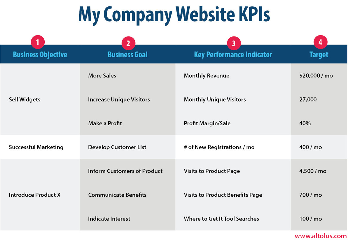
A key performance indicator (KPI) is a metric that helps you understand how you are doing against your objectives.
Without Key Performance Indicators (KPI’s), there’s no way to tell if your site is really making a difference for your business. Setting up this simple method for measuring how your site is helping you accomplish your business objectives over time isn’t complicated and it will provide you a framework for making progress towards your goals.
KPI’s will be different for every business. They can be hard conversions such as filling out a contact form or purchasing a product but they can also be awareness oriented. For example your KPI could be viewing a diagram of how a new product works or the number of pages views to your company resources library.
You don’t need to measure everything, but focus on a few key indicators of success. It’s important that the KPI’s can be accurately measured over time and are specific.
-
Start by reaffirming and listing your business objectives.
-
Define goals that will enable you to reach these objectives.
-
For each goal, define a specific, measurable KPI (e.g., # of new registrations/month)
-
Set a target for each KPI for a specific period (e.g., 1,500 downloads per month)
This chart is a convenient way of mapping out your KPI's and presenting the information. To learn more about using KPI’s to build an amazing website or web app I recommend you check out this excellent guide.
You have never run a usability test
I guarantee you’ll be surprised at what you uncover if you’ve never performed a usability test. Is your messaging off? Are customers not able to find the support resources they need?
Running a test is one of the biggest gains you can make for the effort. It doesn’t have to be costly or difficult.
Testing with your users uncovers the most common problems they encounter on your site. Finding these issues can help you improve the overall user experience, increase conversion rates or confirm if that new feature is ready to launch.
Usability testing improves the design of your product or website by finding and fixing problems with the design. During the design process, many stakeholders provide initial understanding of their audience, and may believe they know best, but usability testing can uncover how people actually perceive and use something or validate the initial assumptions.
You can hire usability experts to help recruit test subjects and work with you to improve the site, though it’s definitely something you can tackle on your own.
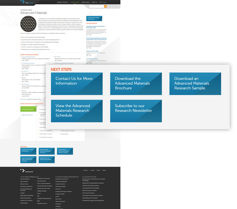
Not Offering Users a Natural Next Step
It’s never a good idea to present your users with a navigational dead end. One common scenario is when scrolling to a bottom of a page, a user will want to know more about a topic. This is a great opportunity to offer other contextually relevant content or a call to action. For example if it’s a services page, include relevant case studies for that line of service. This is also one of your best opportunities to convert users through a form.
Here is a great example of how to provide a natural next step for the user to find more information. In this case it is one specific service offering on a business to business website, but the concept is universal.
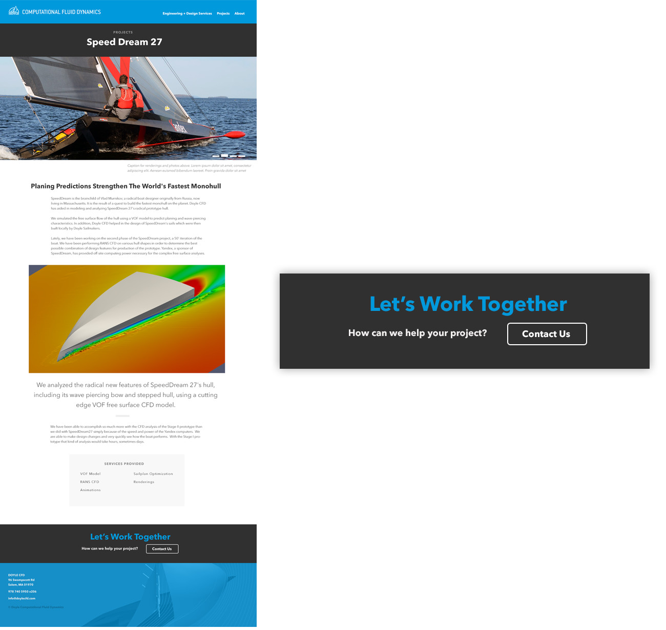
Here is an even more common example that applies to business websites where you need to get the user to contact you. Once the user has reached the bottom of the page, and having liked what they saw, there is a great opportunity to entice them with a call to action. On the Doyle Computational Fluid Dynamics website, this prominent call to action is featured at the bottom of every page as a catch all to ensure users do not reach a dead end.
Not allowing people to page through like similar items
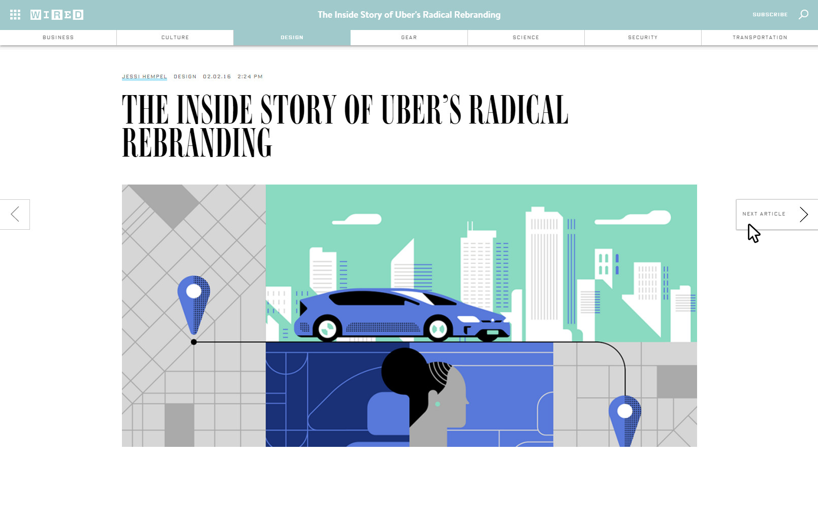
Building on the idea of offering people a natural next step, have you ever been annoyed that a website makes you click back repeatedly to get to the next item in a list? Why not offer the user a “Next” shortcut? It doesn’t interrupt the flow of the content discovery process, and translates really well to touch devices.
Wired is a great example of this as they enable you to use persistent next and previous arrows docked on the left and right of the screen to move within a section of the website.
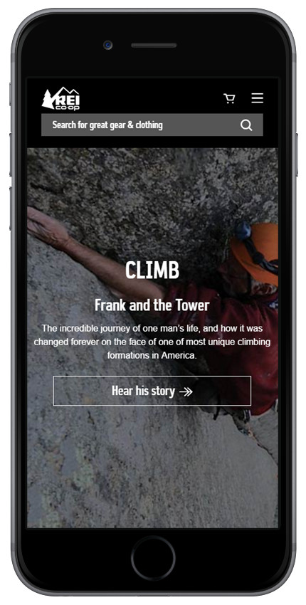
Your mobile user experience is seriously lacking
Having a responsive site or mobile site today is a no brainer, but many sites still aren’t optimized for the average device a visitor might have. Here are some of the most common problems:
Content
With a limited screen size, it’s really important to be succinct and ensure your content is appropriate for its location within the site. For example in the very typical right sidebar configuration on B2B websites, web site managers frequently use this space for cross promotions, but it doesn’t translate well to mobile.
In this screenshot, the right sidebar promotion would be better served as a unique feature incorporated either into the call to actions at the bottom of the page or in a section of the site dedicated to timely content. It's also a good example of the need to keep the scope of any page reasonable and not try to include too many disparate elements.
Another common issue is assuming mobile users only want some of your content and hiding some of what is available to desktop users. It's understandable if not every part of your site or every feature is optimized for mobile yet, but that's no reason to hide it from mobile users - they still want to access this content.
Visual Design
This can be subjective, but for many sites the mobile design is an afterthought once the desktop version gets approved. This can be easier to get everyone to agree on and keep the process moving forward, but it also means you're not focusing on the mobile user experience. To have a site that is distinctive as it is when viewed on a phone as it is a desktop, how that mobile view appears needs to be part of the user experience design process if you are to make the most of the format.
Two companies standout as doing this really well:

You’re not offering the content your users need
Your prospects won’t feel confident to make a purchase, register for your app, or otherwise make a conversion if their questions aren’t answered by your website. Common gaps in a website's’ content include:
-
Imagery is inadequate (Too small or too few product photos)
-
Content doesn’t exist for every stage in the buying cycle
-
Product data is missing - attributes people care about aren’t shown
-
Lacking social proof - missing user testimonials or reviews
To ensure your website isn’t making one of these critical mistakes, base the content on solid user research so you thoroughly understand what your audience needs. By mapping what your users are looking for to specific content, you can be sure that they will have what they need to feel confident in converting.
One way to help understand what your audience needs is to survey your competitors website and create an inventory of what content they are using. It will also provide insight for your content planning to compile and track your customer inquiries to find out what topics and questions come up the most and then develop useful resources around these.
Your content is lacking a strong visual hierarchy
Do your web pages look like the example on the left or the right? Which one makes it easier to find what you are looking for?
Don’t make the mistake of thinking the painful wall of text on the left will make your users happy.
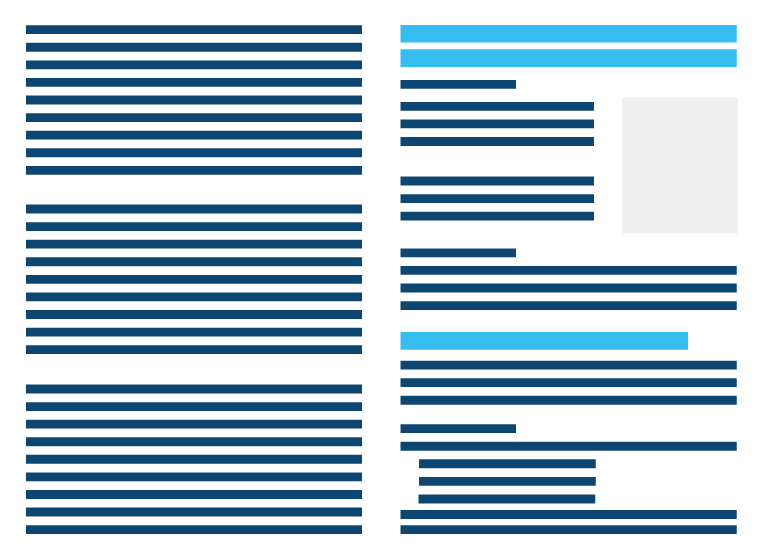
It’s not that long, in depth content isn’t appropriate, it is. However it is much more successful when presented in a way that is navigable and digestible so users can quickly zero in on their points of interest. Some people read whole pages beginning to end, but that is the exception, so it’s best to ensure that users can quickly scan through to find what is most relevant to them.
Some things to look out for:
-
Lead with high level content and let users drill down into specifics - Avoid initially overwhelming them
-
Limit very long paragraphs and break up lengthy information into smaller blocks of text.
-
Use copious headings and subheadings to organize your pages. Make clear the primary, secondary, and supporting elements on the page.
-
Keep a simple layout. Use generous areas of white space to focus users on key information. Ensure a comfortable font, font size and line height. Is your text as easy to read as the New York Times?
Taking the time to ensure your content is well designed and highly readable creates an invaluable first impression to reinforce the value of your message.
Legitimate content ignored because it looks like an advertisement
Are your potential customers ignoring key call outs because they look like advertisements? Users have become adept at filtering out and ignoring anything that remotely looks like an advertisement.
With almost every ad supported website now inserting ads mid content and sponsored content recommendation getting added to the bottom of every article, it’s easy to see why users are likely to ignore this type of content.
We’ve seen this repeatedly in our usability eye tracking testing - users skip over a well designed cross promotion or call out because they subconsciously recognized it as an ad. They don’t bother to analyze it, because they’ve been trained to avoid anything that looks, or is shaped like an ad.
This is called banner blindness it can be avoided by ensuring your navigation elements or other content doesn’t mimic standard ad formats. Avoid the shape of ads, typical ad placement areas and ad like animations.
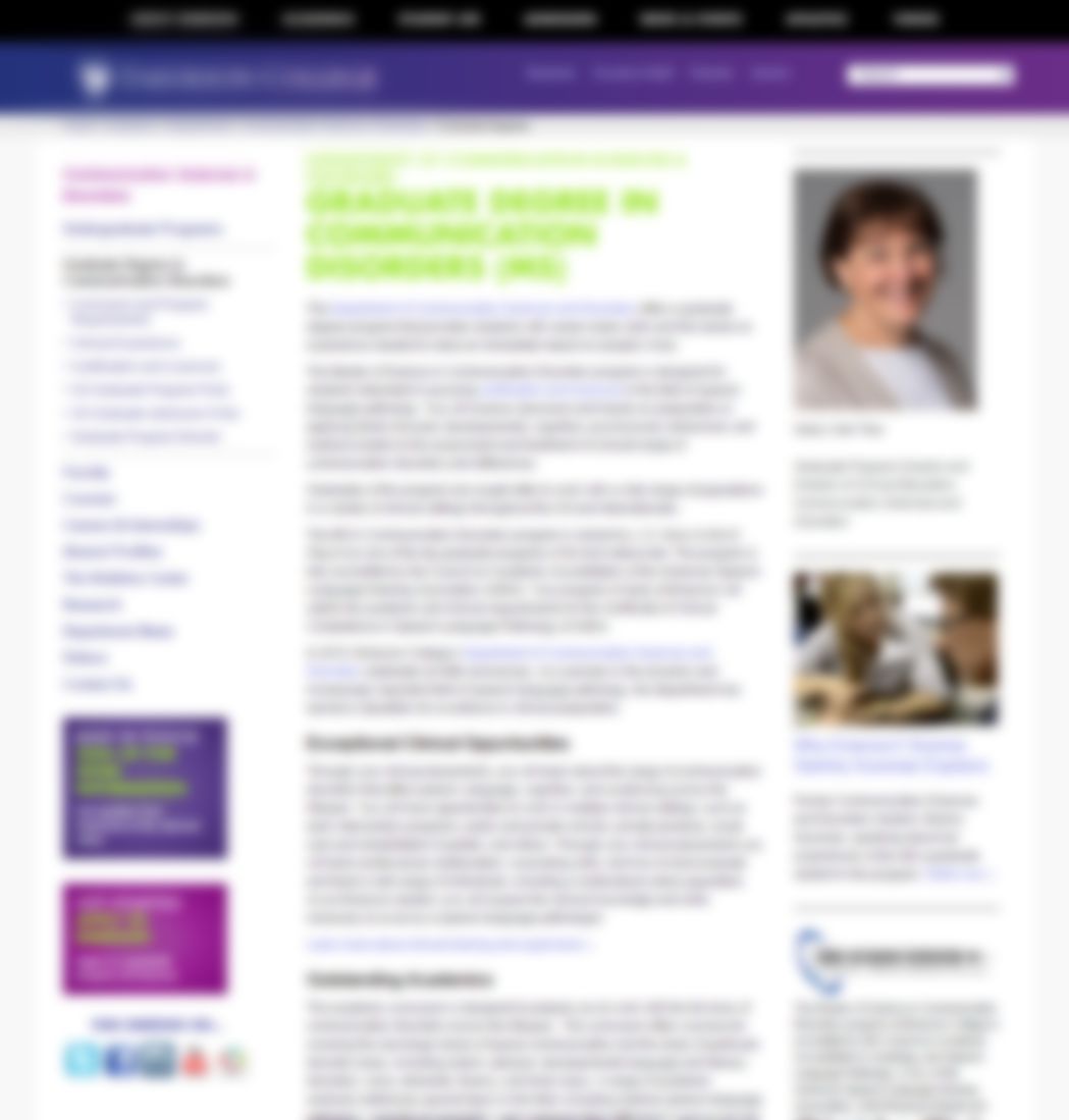
In this screenshot from a higher education website, can you tell what is a banner and what is a call to action? The blur simulates the typical users casual glance at a page, and avoids singling out this institution. There are no advertisements on the site, but in eyetracking testing users perceived the purple blocks as ads and skipped over them. The purple blocks were intended as the primary call to actions promoting key conversion goals for the site.
Pulling it all together
Your website may seem like a never ending project, but by tackling these common website mistakes, you will be following best practices and making the most of your website investment.